Joomla User Manual
Manual Index
Module and Menu Styles
About Cascading Style Sheets
A website page output by Joomla! consists of HTML tags with style
attributes in the form of class statements. For example, a heading
within an article might be <h3 class="special-warning">Watch Out!</h3>.
This heading could be made to appear in a larger font, different
colours for text and background, and perhaps a border and warning icon.
The class styles would be defined in the user.css file in the template,
like this:
    h3.special-warning {
      color: #900;
      background-color: #fee;
      border: 1px solid #900;
      padding: 1rem;
      font-size: 2rem;
    }
This works because the user.css style sheet is loaded last and any
styles it contains take precedence over the same styles in previously
loaded css files. The special-warning style does not apply to other <h3>
tags, only to those with this specific class. It works within an article
because there you type in the class name yourself.
But what if you want to style a module or a whole page? For example you could apply different background colours to different modules or pages. Or you could style your front page heading to differ from the headings on other pages. All of this can be achieved by adding class names in the module edit form or the menu item edit form. The style classes are then entered in the user.css file.
Module Styles
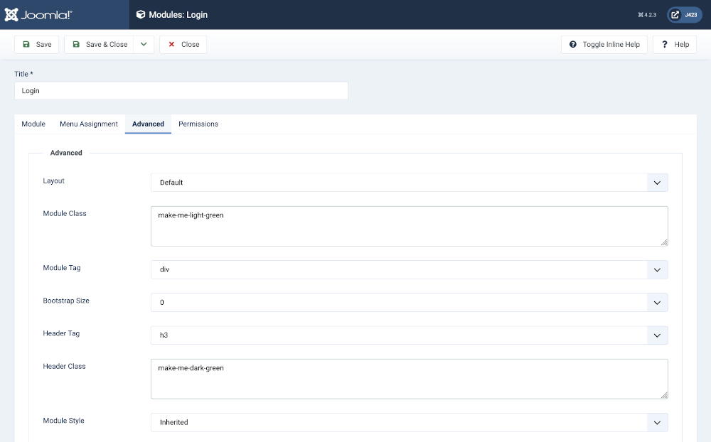
This simple example applies custom styles to the Login module and its
title. The following screenshot shows the style names entered into the
Advanced tab of the Modules: Login edit form. The Module Class has been
set to make-me-light-green and the Header Class has been set to
make-me-dark-green. Note that you can include minus signs or
underlines in class names but spaces separate different class names.

The following style statements are used in the user.css file:
    .make-me-light-green {
      background-color: #efe;
      border-color: darkgreen;
    }
    .make-me-dark-green {
      color: darkgreen;
      border-color: #264f71;
    }
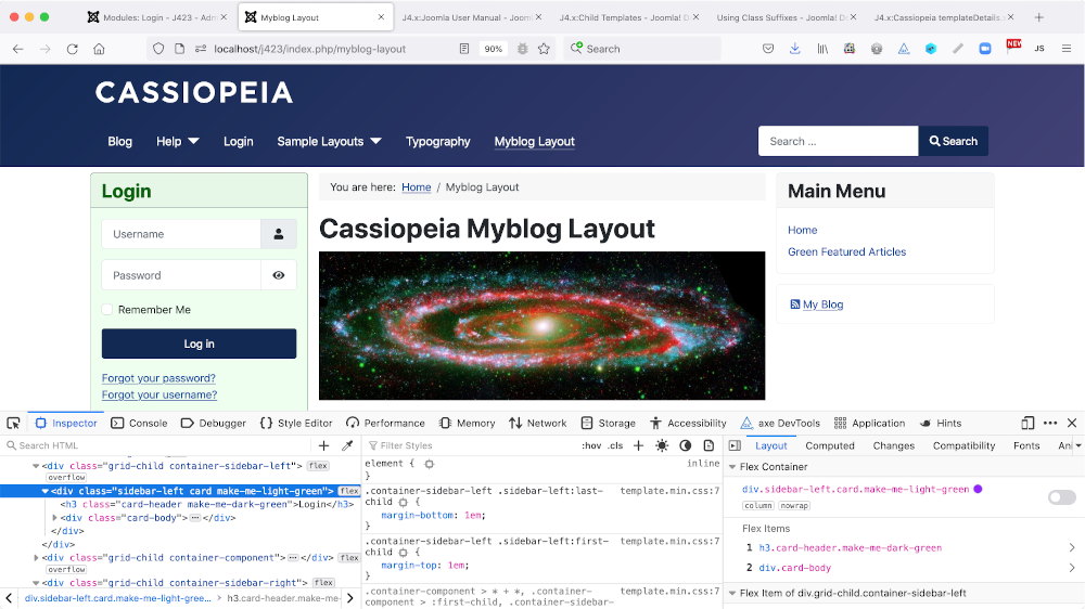
Watch out for the period (.) that is used in css to define a class with that name. The period must not be used in the module data entry form. The result in this example is as follows:

The bottom of the image shows the browser Developer Tools panel with the
Login module's enclosing <div> tag selected. You can see that the custom
Module Class style has been appended to styles already defined in the module
template. The next line shows the <h3> tag also with the custom Header Class
appended to already defined styles.
You may or may not like this module style! But this is just a lesson in how to do it, not on what makes a good colour scheme!
Page Styles
There are several ways to customise the overall appearance of a page. All work via the Menus: Edit Item form:
- The Details tab has a Template Style option from which you can select a specific template to use.
- The Blog Layout tab has a Leading Article Class and Article Class fields in which you can type in a class name.
- The Options tab has Choose a Layout field from which you can choose from available layouts for all items.
- The Link Type tab has fields for a Link Class, a Link Icon Class and an Image Class.
- The Page Display tab has fields for a Page Class.
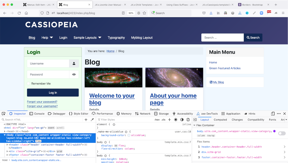
It is the last in this list that is covered in this article. What
happens with make-me-aliceblue entered in this field? And the
following is entered in user.css:
    .make-me-aliceblue {
      background-color: aliceblue;
    }
The class is added to the body tag of the page:
