Joomla User Manual
Manual Index
Page Analysis
Lighthouse
Lighthouse is an open-source, automated tool for improving the quality of web pages. You can run it against any web page, public or requiring authentication. It has audits for performance, accessibility, progressive web apps, SEO, and more.
It is available as an add-on tool for Google Chrome and Firefox and it can be run from the command line. That is useful for testing on a local development environment.
More information from the Chrome for Developers: Lighthouse website.
You can use the tool online from the PageSpeed Insightsthis site.
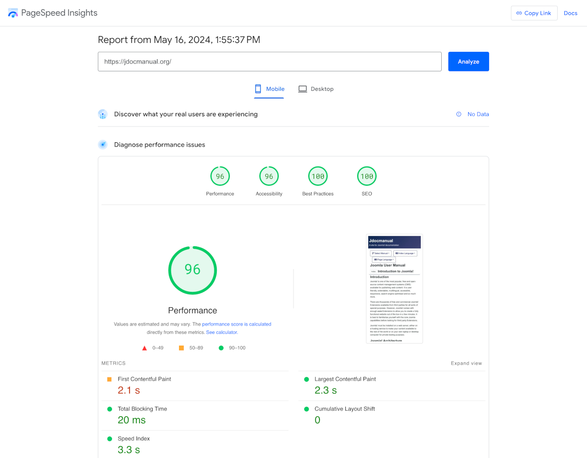
The following screenshot shows the first part of the PageSpeed Insights report:

Performance Improvements
The second part of the report suggests methods to improve performance:
- Eliminate render-blocking resources - Potential savings of 540 ms. Frankly, this is too much work for too little reward.
- Enable text compression Potential saving of 11 KiB. In Global Configuration, Server panel, set GZip Page Compression to Yes. That leaves small JavaScript and CSS files yet to be minified and compressed.
- Reduce unused CSS Potential savings of 62 KiB. The culprits are template.min.css and joomla-fontawesome.min.css but that implies tayloring the CSS for each page in the site which is too much error prone work for too little reward.
- Serve static assets with an efficient cache policy - 21 resources found. References provided, including Joomla specific references.
The overal message is that some suggestions are worthwhile fixing and others are not.
Mobile vs Desktop Report
The Desktop report usually differs from the Mobile report. Some extra issues identified in this case:
- Properly size images - Potential savings of 48 KiB. The image tag is actually optimised with webp images at 768 and 1200 pixels wide. It seems that something in between is called for.
Accessibility
- Links do not have a discernable name This refers to the Left and Right arrows at the bottom of the page that navigate forward or backward. The text was left out to avoid translation problems. Need to think again!
- Touch targets do not have sufficient size or spacing This refers to the size of the menu items in the left and right columns. They need more vertical space - a CSS tweak is needed.
Best Practices and SEO
Although both scored 100 for Mobile and Desktop they need to be checked again after every design change.
Summary
All the problems in this site fixed except for dismantling the css files and minifiying the small component Javascript and CSS files.