Joomla User Manual
Manual Index
Number Field
Purpose
The Number field provides a method to enter a real number with an option to attach a currency or other symbol before or after the number. The control allows for use as an integer field with increment and decrement arrows with a default range of 1 to 100. However, real values, positive or negative can be entered into the field. Example: 99.99 could be formatted to appear as £99.99 to the end user. Or -273.15 could appear as -273.15C to the end user.
Field Creation
General tab
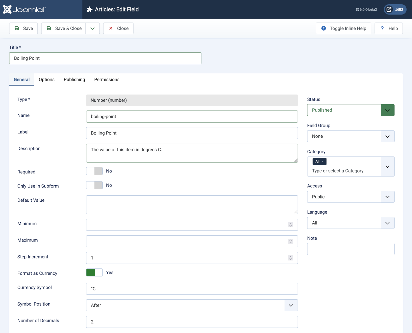
- Type Number, which cannot be changed after selection.
- Name The unique name of the field.
- Label A translatable label for the field.
- Description An optional translatable field description.
- Required Set to Yes if this field is required?
- Only Use in Subform *Yes or No.
- Default Value An optional default value.
- Minimum Minimum value that can be chosen using the up/down arrows, default is 1. It can be a negative number so set it to less than the lowest number expected, otherwise selection of the down arrow may erase the existing number.
- Maximum Maximum value that can be chosen using the up/down arrows, default is 100. Set this to higher than the highest number expected, otherwise selection of the up arrow may erase the existing number.
- Step Increment The size of the increment added or subtracted to current field value using the up/down arrows. This can be an integer, the default is 1, or a decimal such as 0.01. Set it to the smallest amount by which you wish to increment or decrement the value.
- Format as Currency If selected there are additional fields:
- Currency Symbol This can be a single symbol, such as
£or$, or a character string, such as°Cwhich appears as °C. - Symbol Position Select Before or After the number.
- Number of Decimels Typically 2 for currencies but could be something else in other contexts.
- Currency Symbol This can be a single symbol, such as
Options tab
Form Options panel:
- Placeholder Placeholder text which will appear inside the field as a hint to the user for the required input.
- Field Class An optional class added to the data entry form field.
- Label Class An optional class added to the data entry form label.
- Editable In Allowed editing interfaces: Site, Administrator or Both.
- Showon Attribute Conditionally show or hide the field depending on the value of other fields.
Display Options panel:
- Display Class The class of the field container in the output.
- Value Class The class of the field value in the output.
- Label Show or Hide the label in the out put. If set to Show:
- Label Class (Output) A class for the output label.
- Automatic Display Whether and where to display the field:
- After Title
- Before Display Content
- After Display Content
- Do not automatically display
- Prefix Text that will appear before the field value.
- Suffix Text that will appear after the field value.
- Layout a list of available layouts.
- Display When Read-Only Choice of Inherit, Yes or No.
Smart Search panel
- Search Index Choice of search or not and search method.
Publishing and Permissions tabs
The content of these tabs are self-evident and covered elsewhere.
Data Entry
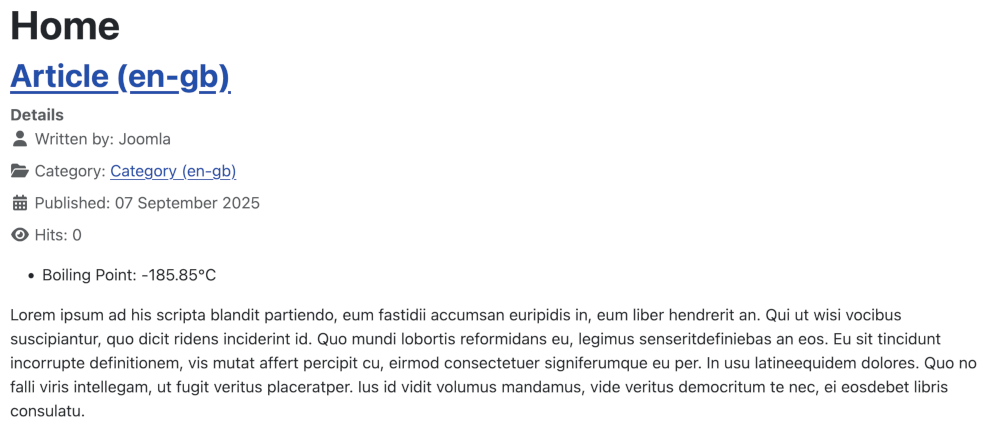
Data entry: simply type in the value you want. This example is the boiling point of Argon:
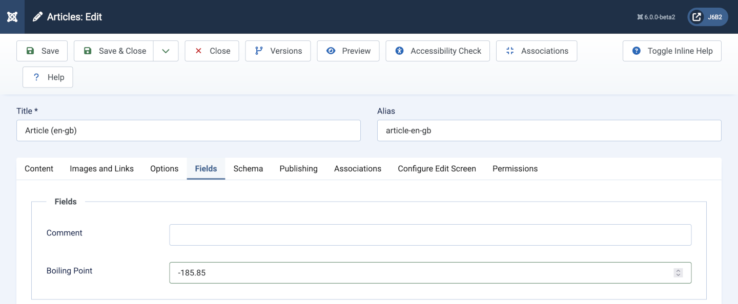
Beware: if the number you enter is outside the minimum and maximum range set in the field creation options a browser hover label will tell you so but the information provided is not enforced. You can enter a number outside the range and it will be accepted.
Data Display
The following image shows the display of an item with a negative value: