Joomla User Manual
Pagination Wrap
In Joomla, Lists of articles, users and other items may be very long so they are displayed in batches, 20 by default.
The Normal Pagination Bar
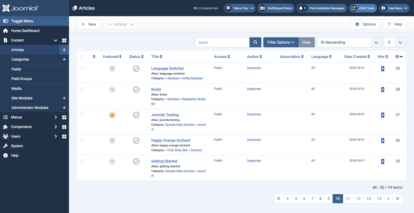
To navigate the batches there is a pagination bar beneath the list of items allowing the user to select the next batch of items, as in this illustration:
Pagination on Narrow Screens
The pagination bar works well on wide screens. However, on narrow screens the pagination bar may be wider than the screen. This causes a requirement to scroll to the right to find other items on the page, such as menu hamburgers.
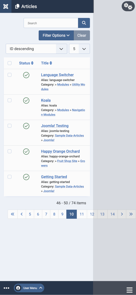
In the illustration above, any items in the grey area to the right are off-screen initially and likely to be missed. The user must scroll to the right to see them. In this case the off-screen items are the Toolbar icon at the top right and the Menu icon at the bottom right.
Fix with a Template Override
This fix adds a flex-wrap class in the code that generates the pagination bar.
- In the backend, go to System > Administrator Templates > Atum Details and Files
- Optionally, select html > layouts just to see what is there
- Select the Create Overrides tab
- In the Layouts box select joomla and then pagination
- In the Editor tab select html > layouts > joomla > pagination > links.php
- Find line 70 containing
<ul class="pagination ms-auto me-0"> - Add
flex-wrapto the list of classes:<ul class="pagination ms-auto me-0 flex-wrap"> - Save & Close
- Optional: You can delete /html/layouts/joomla/pagination/link.php and /html/layouts/joomla/pagination/links.php
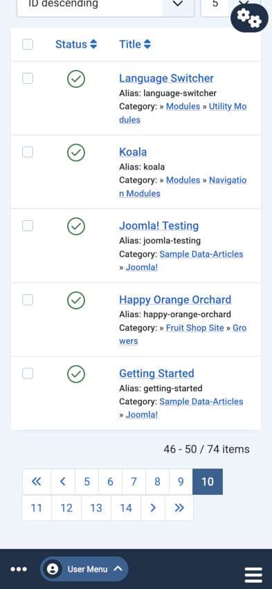
Look at the result on both wide and narrow screens. The narrow screen now shows the Toolbar icon and Menu icon in the normal width of the screen:
For the site template, follow these instructions but create an override in the Cassiopeia template.